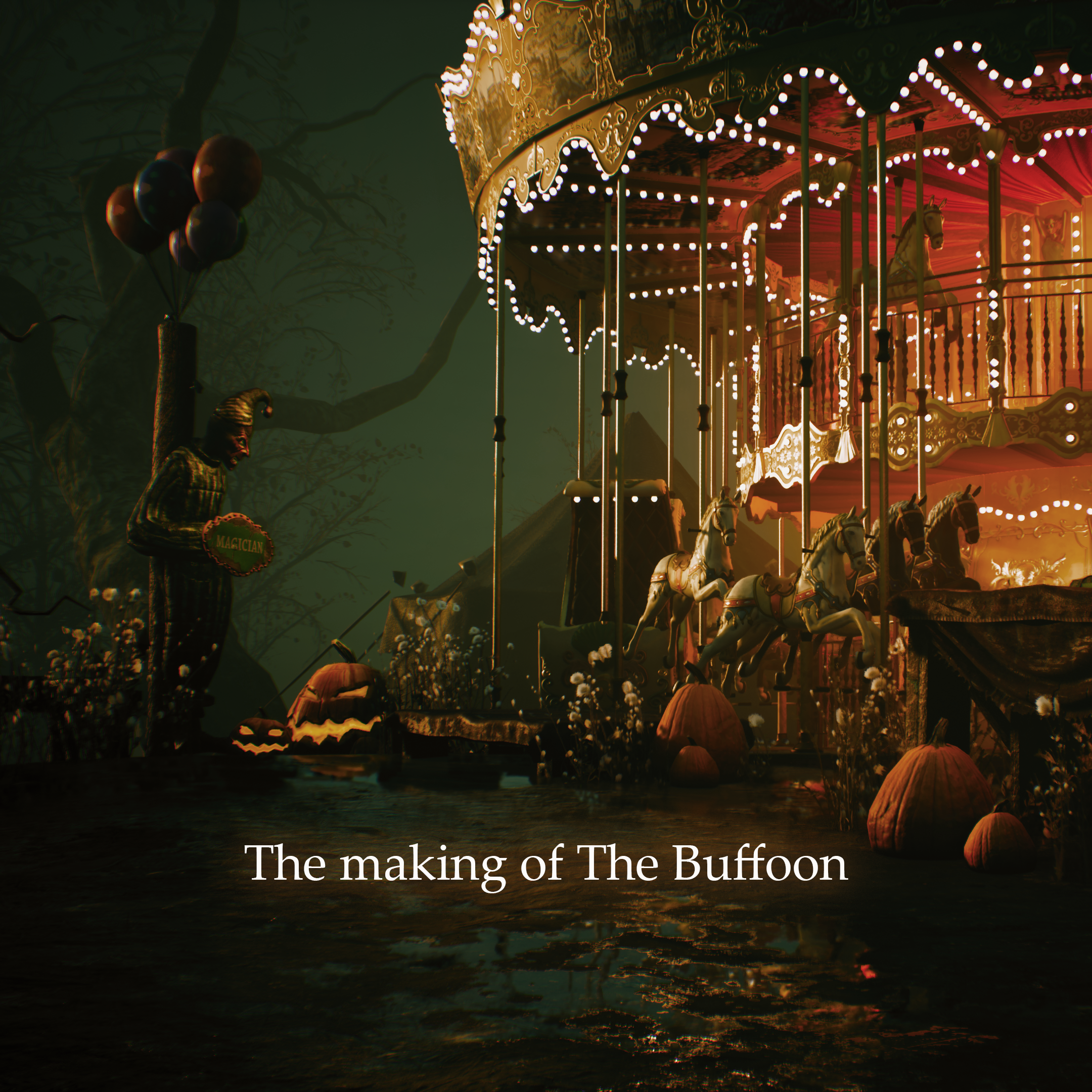
The making of The Buffoon
In this lighting diary I talked about the lighting design process of my personal work, the buffoon.
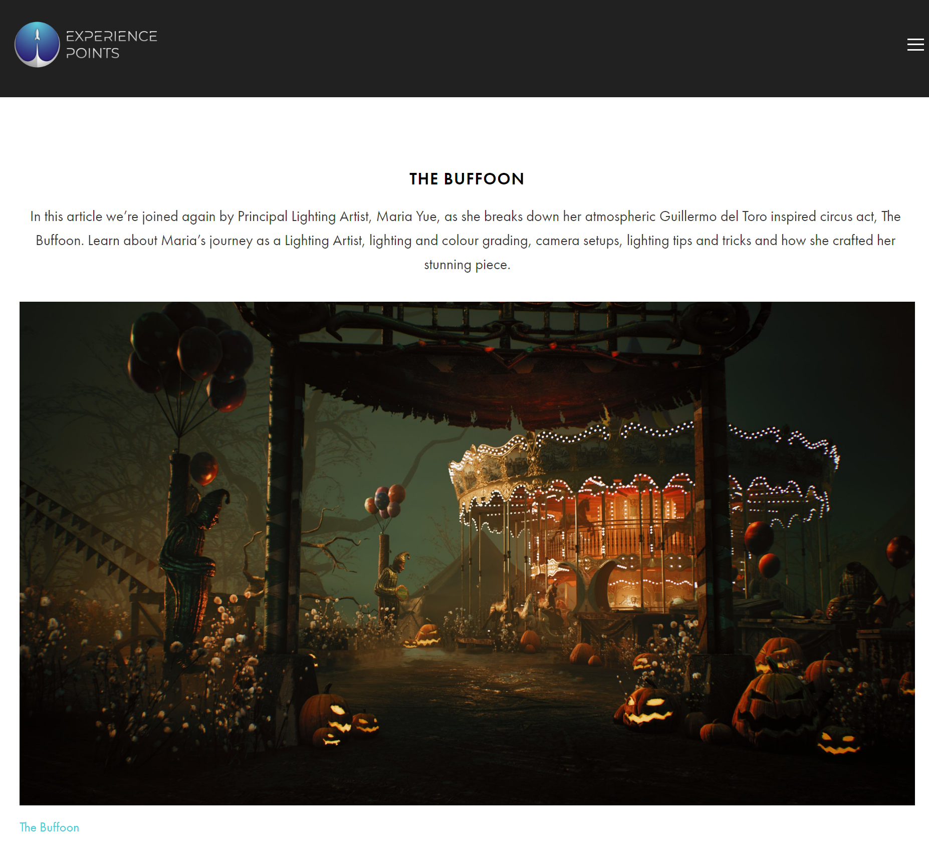
I am very happy to share that this project has also received an interview invition from the Exp Point.
Inspiration
I have always loved the mysterious and sweetly-horror atmosphere of the circus. Some examples of such games and movies are NieR: Automata and The Nightmare Alley.
For me, I believe that the primary function of lighting design is to create a specific mood and to awaken empathy in the audience or player. In addition, video game lighting has a unique characteristic, which is providing guidance. As a lighting artist, I often receive requests to meet both of these requirements and maintain visual consistency across many of the titles that I work on.
Speaking of mood and style, a very reason I love doing my personal work is because it gives me the freedom to pursuer styles I enjoy and express the ideas and emotions. If someone were to leave me a comment that matches the exact mood I am trying to emphasize in my project, simple things like that could make my day and fill me with joy.
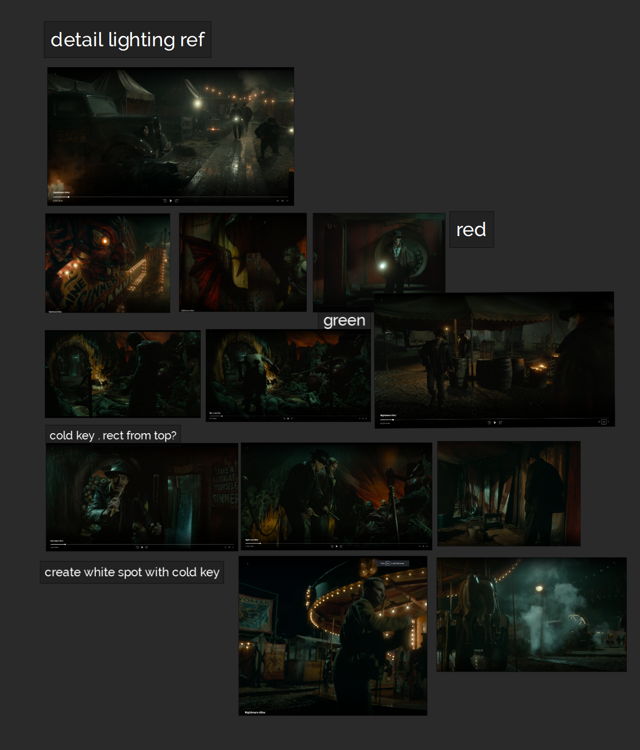
“This project is heavily inspired by Guillermo Del Toro’s amazing film ‘Nightmare Alley.’ To create the ambient light setup, I have gathered a few screenshots as references (the screenshots are for reference only, and all rights are respectively reserved to the content creators). In the movie, most of the colors are desaturated, with an elegant mixture of gray tints. As a lighting artist, I can tell that most of the final result is a combination of multiple light and secondary light sources, such as fog and dust.”
I usually decide on my color palette based on the final result only, which means the color palette only refers to the outcome of the mixture between lighting, diffuse color, and fog.
Until I reach the very last stage of detailed lighting polish, the albedo of my volumetric fog remains mid-grey, and this is simply due to fog being a medium reacting to the lighting, rather than a light source illuminating the scene. I feel any colour-related change on the fog could easily affect the entire scene. After years of practice, I have gradually developed the habit of keeping my fog colour neutral unless I absolutely have to add any extra colour to achieve a very specific look.
Moreover, I usually only have an idea of how to add the extra colour to the fog after the lighting setup is finished. This is because I can only see how the fog reacts to the lights and how the scattering effect looks once the full lighting setup is complete, and it tends not to change much afterwards.
Asset selection and level construction
My personal projects are always driven by my own interests. The circus is one of the topics I have wanted to develop a lighting design for.
Initially, this idea was more horror-theme based. I was fascinated by Slavic folklore, like Baba Yaga. In the beginning, the idea revolved around an abandoned place in a dark forest. I referred to the mood of Pan’s Labyrinth a lot (yes, directed by Guillermo del Toro again). I enjoyed checking the monthly free offerings from the Epic marketplace, while I also purposefully searched for asset packs with keywords related to whatever I was interested in at the time.
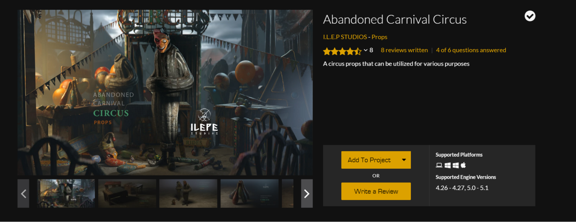
Initially, I had acquired this abandoned carnival circus pack from the Epic marketplace quite some time ago. The iconic horror face sculptures in this asset package somehow reminded me of the Whateley family from H.P. Lovecraft’s novella, The Dunwich Horror. The asset is fantastic for lighting, but back then, I could not figure out the best mood for the lighting design.
It wasn’t until I watched the movie Nightmare Alley that I found inspiration.
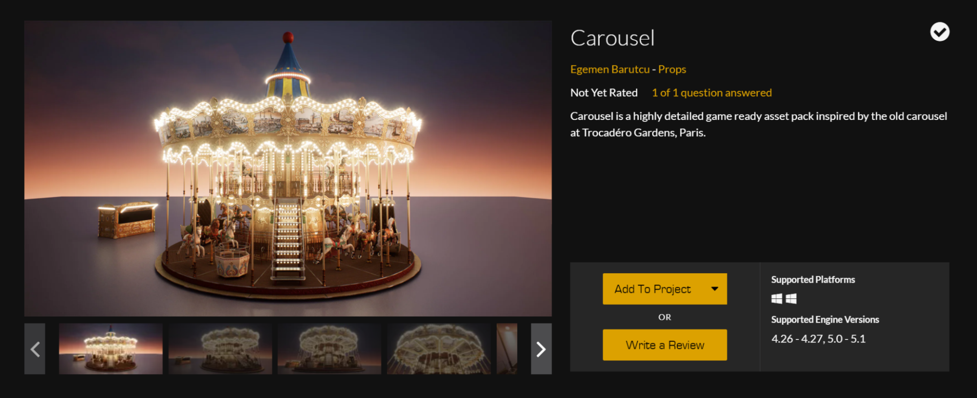
The circus scene from the film really captivated me. Additionally, since I was planning the lighting design around Halloween, I got a free pumpkin pack from the Epic marketplace through their monthly free share. The only asset I was actively searching for to complete this project was a carousel. It was incredibly exciting when I found the one made by Egemen Barutcu.
Speaking of personal work, I see myself as the type of artist who has a very specific style preference. Not all of the styles I like are popular in terms of trends, but I am also quite stubborn about my choices.
The last thing I would be passionate about in my creative journey is making something merely because it’s trendy. On one hand, it’s always great to receive positive feedback about our personal creative projects. On the other hand, I find it difficult to be motivated by doing something simply because it’s trendy, as opposed to creating a personal project with a style that genuinely fascinates me.
Compared to what I do in my full-time job, even if it’s the same craft using precisely the same tools, my personal work is always and solely about expressing feelings, ideas, or snippets of stories related to my own experiences. I find that this is the best way to keep myself motivated and to continue evolving from both an artistic and technical perspective.
Lighting setup
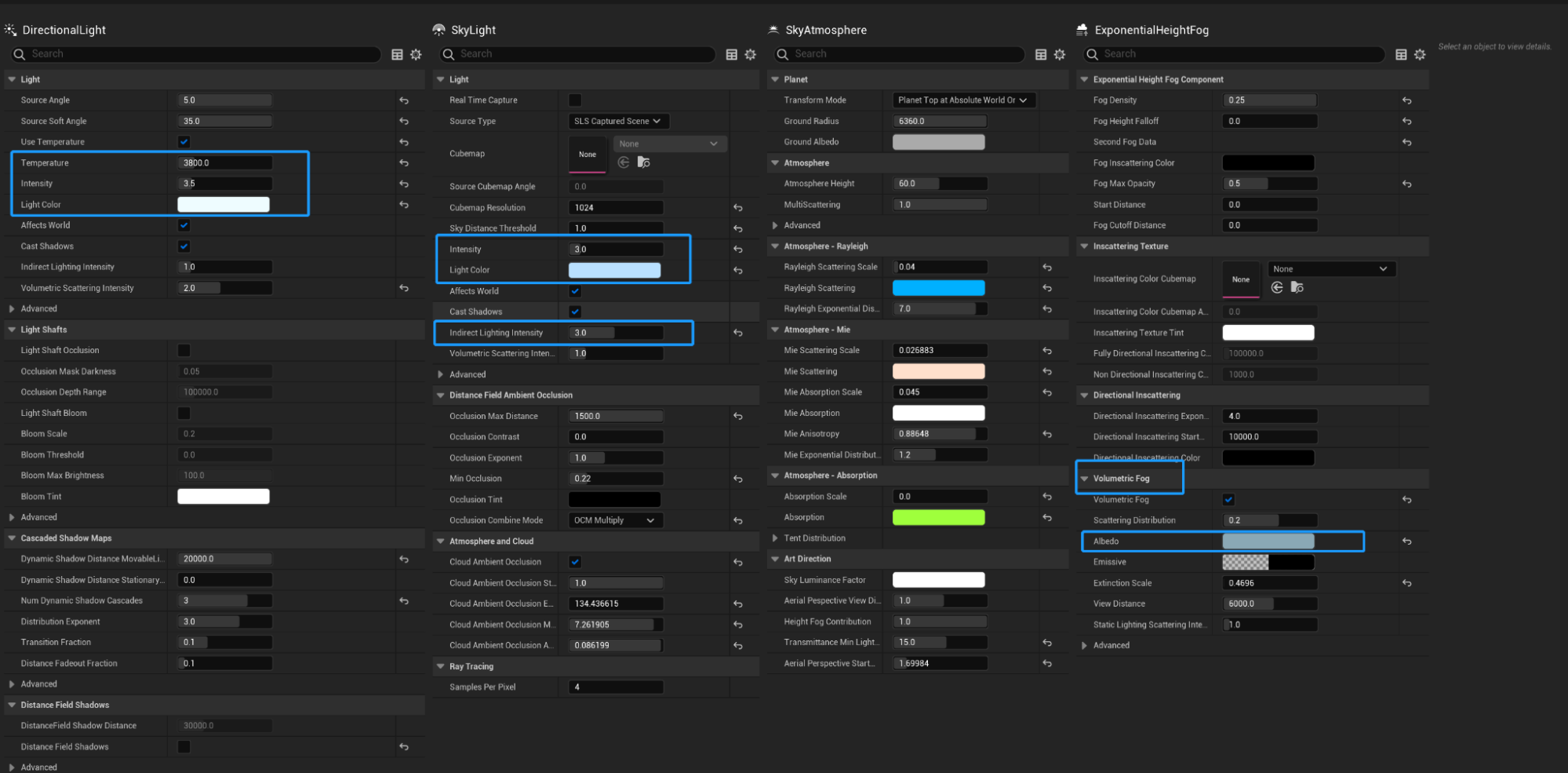
Below is my ambient light setup. Since I have assembled a very colourful scene – the circus assets feature a lot of colour by default – I keep my directional light colour white. However, I use the colour temperature to introduce an anxious, sunset-orange tint.
Instead of using an HDR texture-based skybox, I decided to use the SkyAtmosphere in this project. As my scene is small with many close-up shots, the physical SkyAtmosphere is the best medium for light colour mixing.
I’ve always loved the mixing of colours and scattering effects brought about by multiple light sources. In this project, I would like to leverage the advantages offered by UE5 in combination with the directional light, sky light, and volumetric fog.
Exposure set up
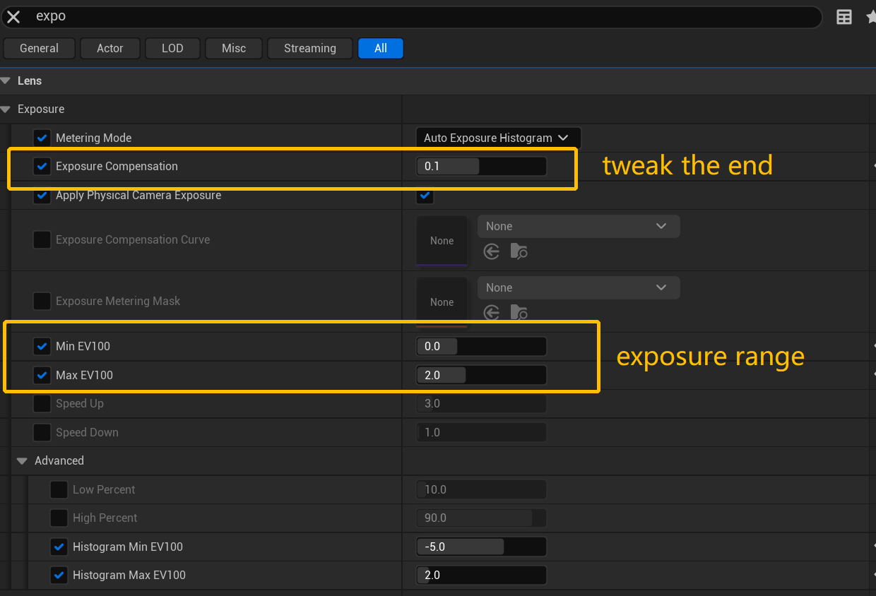
For a haunted scene, darkness is always effective in enhancing the mood, while I would also prefer to retain as much detail as possible.
In the exposure setup, there is a range allowance locked between Min EV100 at 0 and Max EV100 at 2. This setting allows the eye adaptation to function as an auto-exposure bar, making it more forgiving while viewing both dark and bright areas in real time. I adjusted the exposure compensation slightly towards the very end of my production for better contrast.
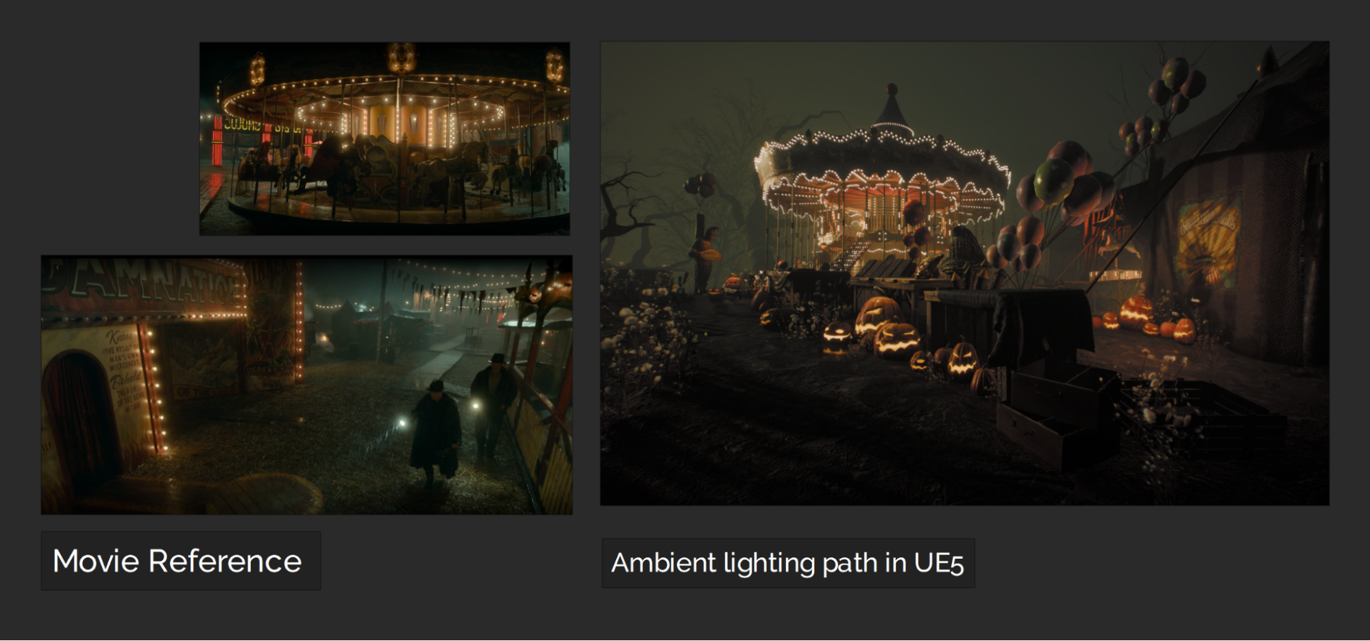
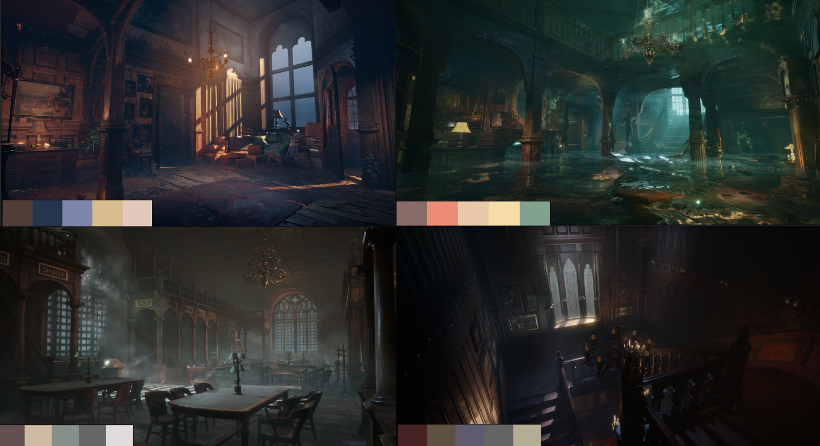
Later, I decided to push my fog colour towards a misty blue, very similar to the skylight colour I used, as I wanted the fog in the background to have an even heavier blue base to contrast the warmly lit carousel. Since the final result we see in lighting is always a mixture of direct and indirect light sources, with the warm 3800K on my directional light, the background of this scene ultimately achieved the melancholic teal mixture shown in the screenshot below.
Above is the initial ambient lighting mixture I have, with the teal background achieved via a combination of warm sunlight and cold blue skylight.
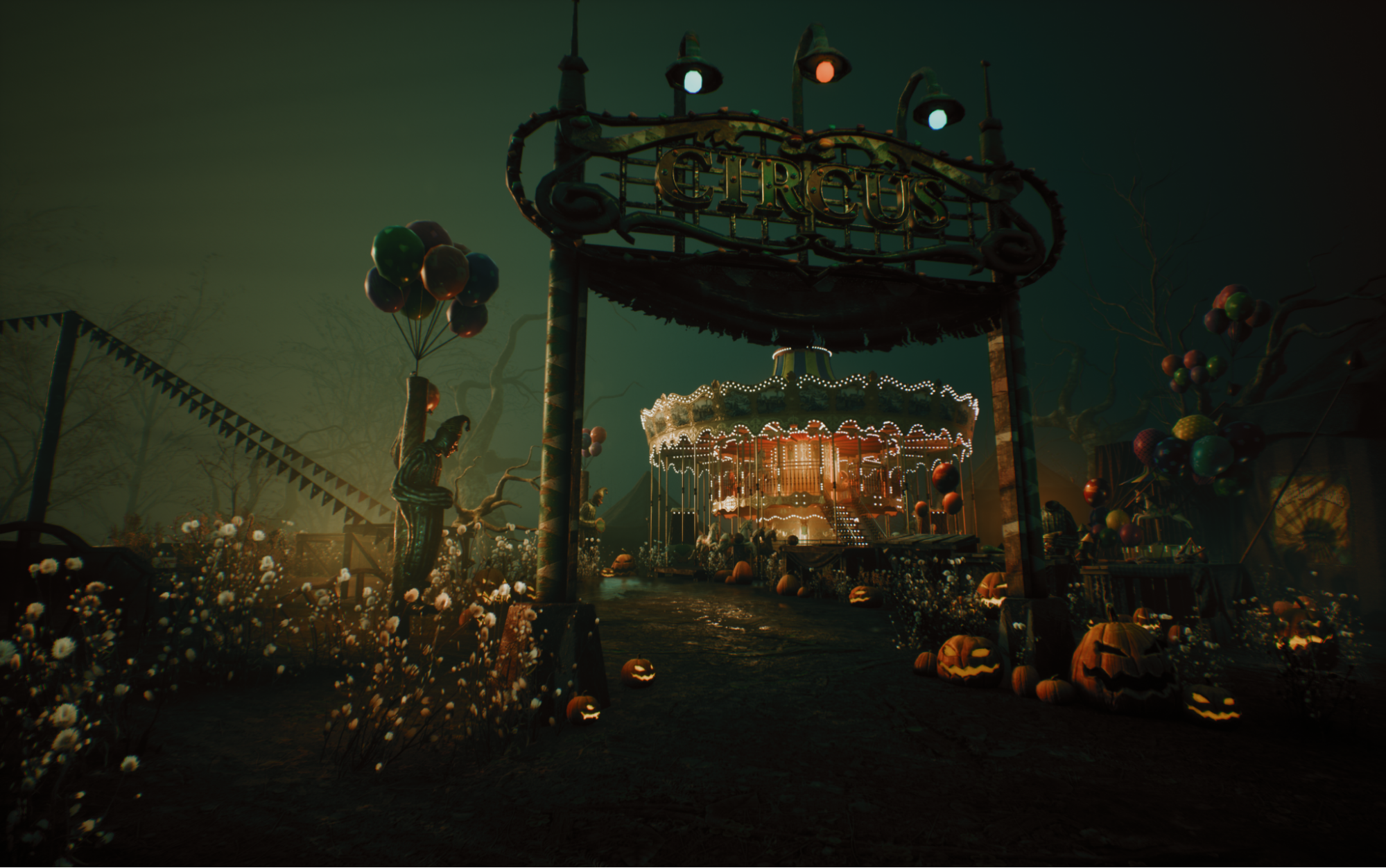
However, later I decided to decrease the teal colour slightly. Although the current result looks quite striking, in my opinion, the colour difference is a bit too ‘loud’. Personally, I have always admired elegant falloffs and detail-oriented lighting transitions more than the super-contrasty style.
Any aesthetic decisions at the polishing stage are usually based on personal taste. I believe this is the very reason why personal projects always excite me. They present a perfect opportunity to showcase our own creative standards, test new technology within the tools, and learn something new while enjoying the expression of our own ideas. I refined this ambient light setup later on.
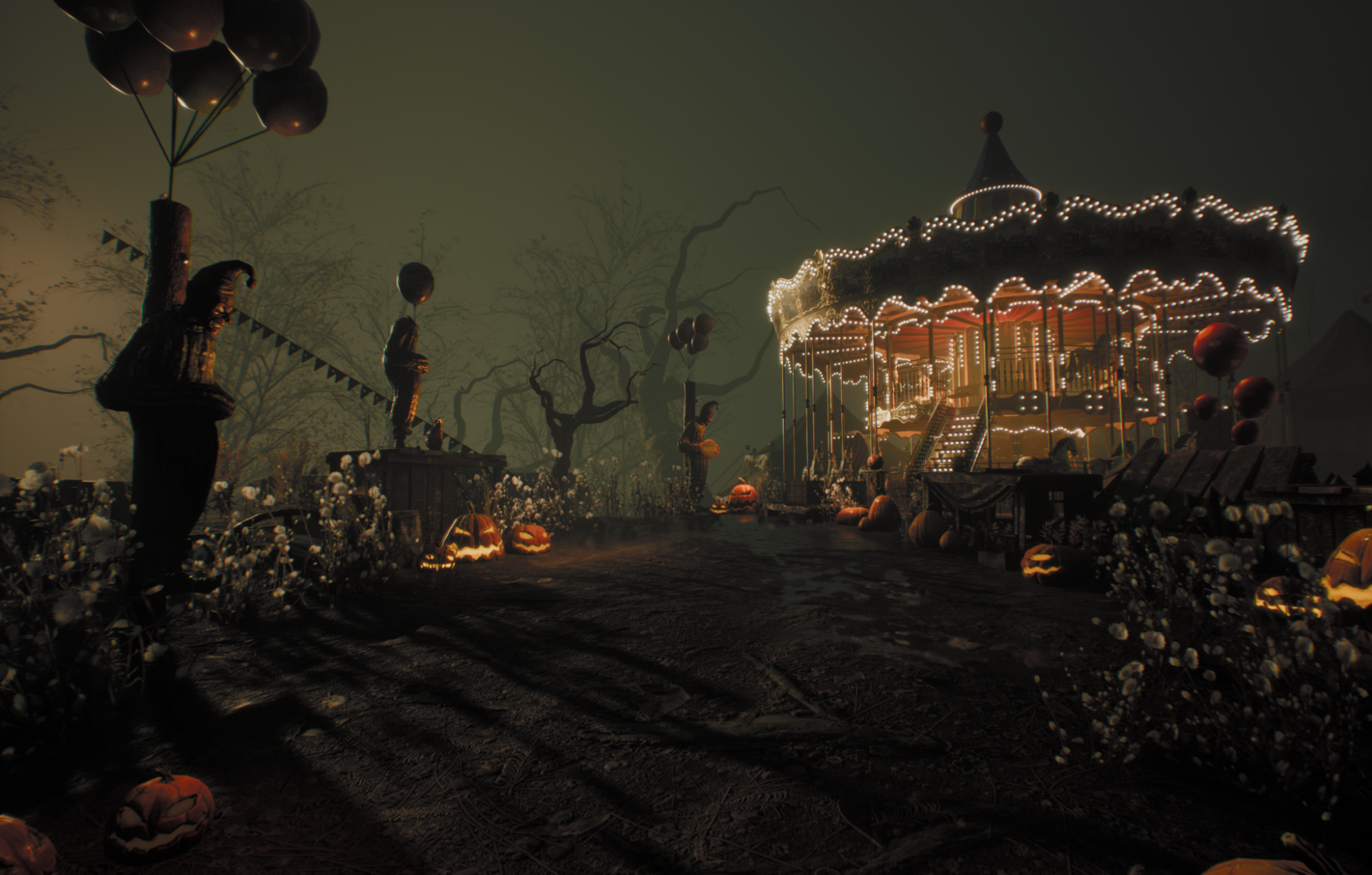
Above is an image closer to the final look. I decided to decrease the blue tint on my fog, as the previous result did a good job of distinguishing the foreground from the background. Composition-wise, I felt it was too obvious, which is why I decided to reduce the gap between the warm and cold tones in the end. I aimed for a visible but gentle transition between warm and cold tones in this piece.
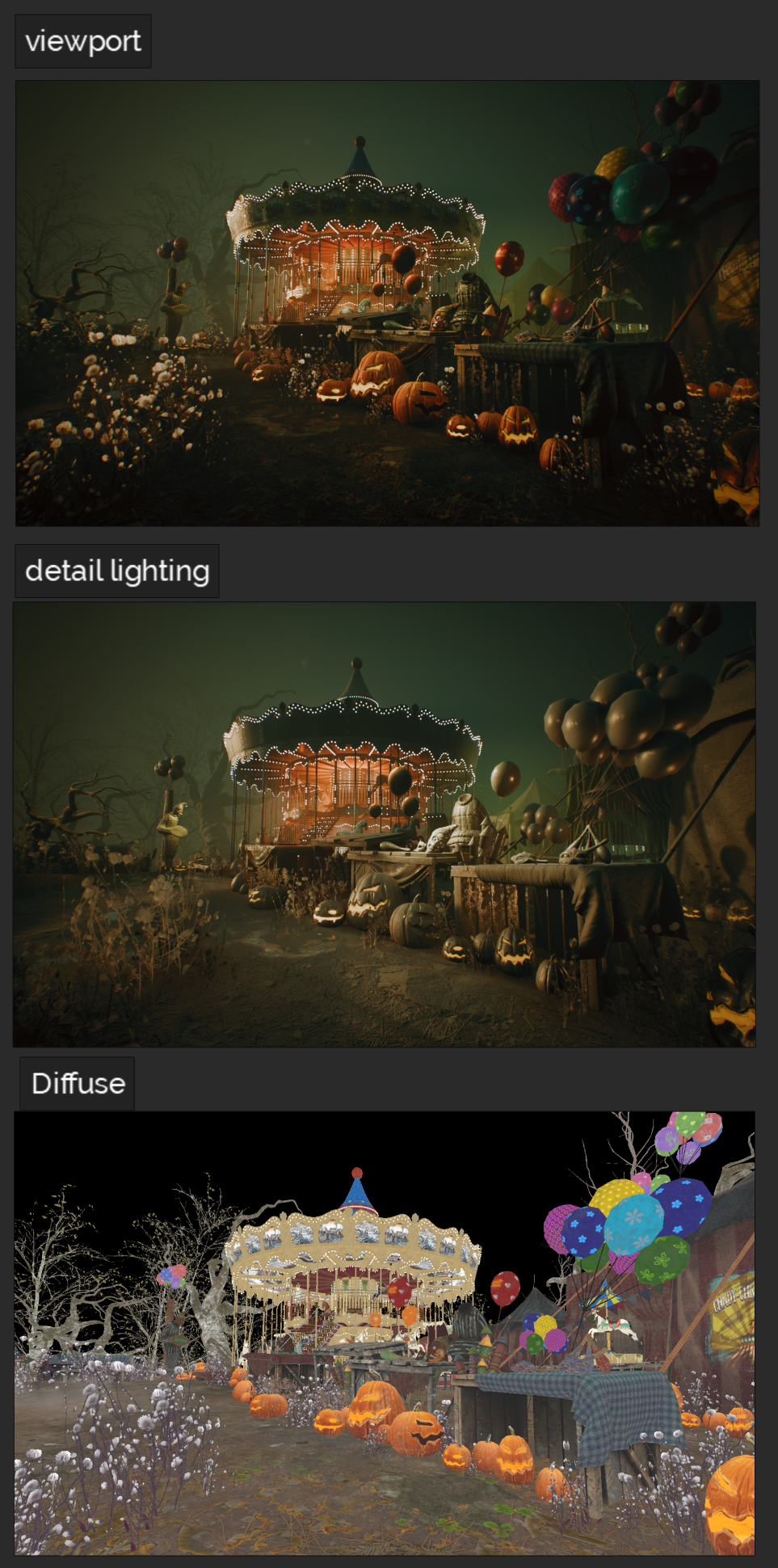
It can not be easier to get lost while working with very colourful assets, as adding colourful lighting to an already vibrant scene can easily deceive our eyes.
While working on this scene, I kept switching between light-only, diffuse, and viewport versions. This approach proved to be an effective way to remind myself of the extent of colour addition on top of textured assets and to gauge the influence brought about by each light I introduced into the scene.
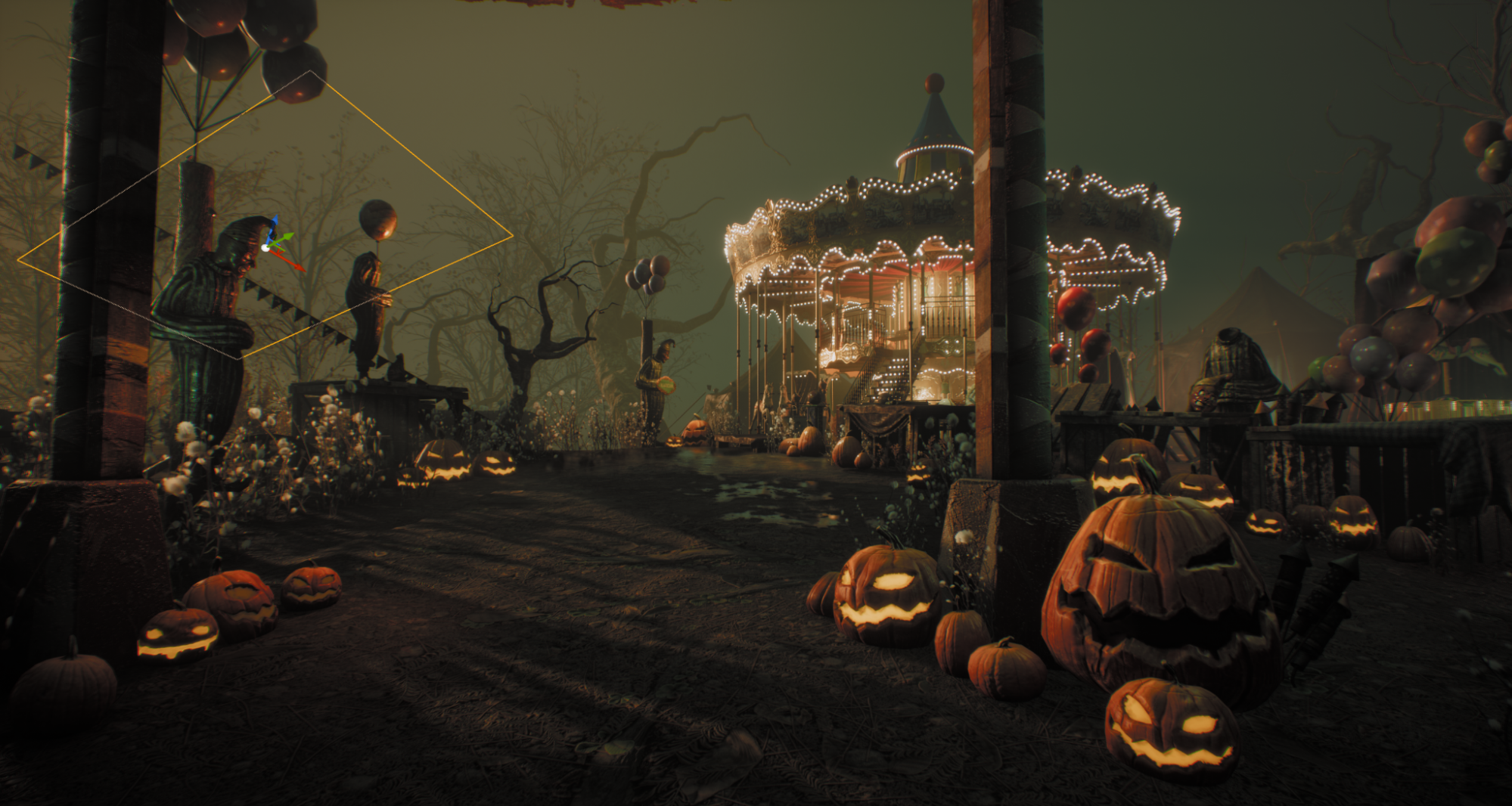
As I assembled this scene myself, I carefully placed the assets to cohere with the directional light angle I had in mind. If I were to explain my scene using primary shapes, we could simply regard the carousel as a cylinder, and the booth where the buffoon figure stands as a collection of cubes.
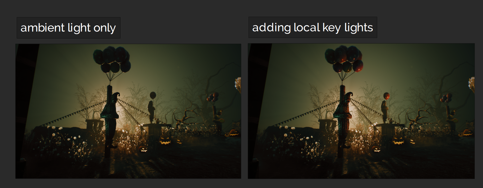
Whilst assembling the scene, I have already decided that I want my key light to come from the upper left angle. This is the best incident angle for the cylindrical carousel to catch a bit of high light on the upper left, and using this angle also benefits the revelation of the carousel’s volume. The depth of the scene is rather shallow in terms of distance. Therefore, I would prefer to emphasise the dimensional volume of each asset instead of adding too much filled light, which could easily flatten everything and decrease the overall focus of the compositing.
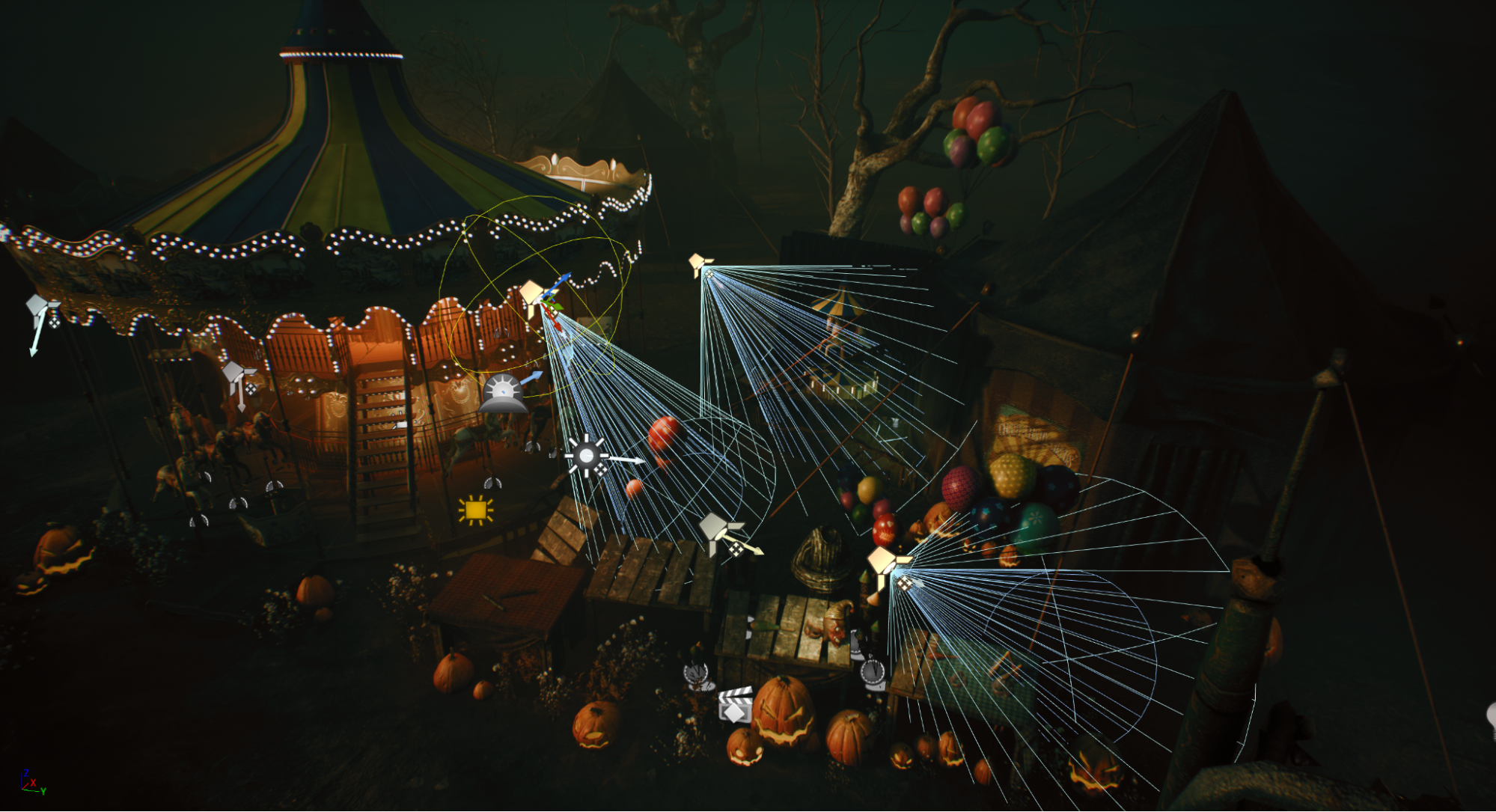
When it comes to setting up the local key light, consistency is my top priority. Rather than creating additional practical lighting sources and hanging them throughout my scene, I have chosen to expand the coverage of the directional light through the use of local spot lights. The execution is quite straightforward; I will simply use local spot lights to extend the coverage of the sunlight.
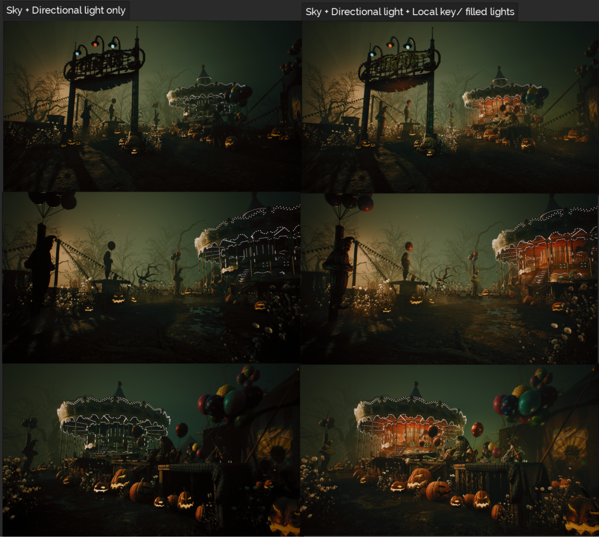
If we take a second look at my sky/ directional light intensity, you will notice I set the brightness very gently. As I do need the correct incident angle to drive the volumetric fog scattering latter. I do not want an overly bright directional light to wash out the entire scene. Instead, I use local spot light to highlight the small areas where I have placed reflective surfaces (figures, tables, tents in the scene).
Take a look at the screenshot below, you will notice that most of my local spot lights are almost aligned incident angle wise. It is simply because I want all of them to deliver a reasonable look as if it comes from a single light source.
Whenever the brightness of an area is increased, the depth of the scene is decreased at the same time.
However, this does not mean that adding light on top of another should be avoided. To me, the theoretical concept of painting with light means controlling the brightness among multiple light sources. The result is to create contrast between the lit side of a subject and its shadow side.
The light ratio is a fundamental aspect of photography, and while I won’t write a dissertation about how to use it here, I will mention a practical application in this project. Specifically, I have kept my directional light relatively dim in terms of brightness. Additionally, the directional light shapes the entire scene while providing enough margin for adding extra spotlights. As a result, I can easily add highlight areas even if the scene is already illuminated by a global directional light.
The result is similar to painting the highlight area with a white brush on top of a painting.
Working with multiple lights
⦁ Focus on the scene, not the lights.
When working with any scene, how to focus on the point of interest in the scene is my primary concern. In other words, I design the light based on where I would like my audience to look, and which mood I would like to deliver to the audience who is looking at my work.
Even though my work is all about lighting, my focus is never the light source itself. There are two primary goals whenever I am designing my lighting setup, presenting the key object and its surrounding space, addressing the mood.
⦁ Adding light is necessary, but reduce unnecessary light bounce is also matters
We keep adding lights in the 3D world. However, in real- life, reducing unnecessary light is an everyday challenge to gaffers, photographers. Perhaps this is one of the benefits of learning lighting from the field photo shooting and stage, it builds a habit of using as little light source as possible, even in the 3D world there is no voltage and heat to worry about anymore.
⦁ Figure out the ambient light before shaping up the details
I tend to define the ambient lighting before any other local light rigs, regardless if the scene is interior or exterior, a fine ambient light helps me define the potential exposure range, contrast level among the highlight and shadow area. I usually lock up my exposure setting once I am happy with the ambient light setup, as it provides me a narrow down on exposure range, with a stable tone as a canvas. Personally I tend to call my ambient lighting setup as ‘Canvas lighting’.
⦁ Design the incident angle carefully.
Using spot light or other directional lighting actors to shape up the key objects is the next step. I could sit in front of my screen and try thousands of possible incident angles of my 1st key light for the whole day, however, as the initial ambient and key light is completed. The rest of the light rig is going faster afterwards.
Volumetric fog
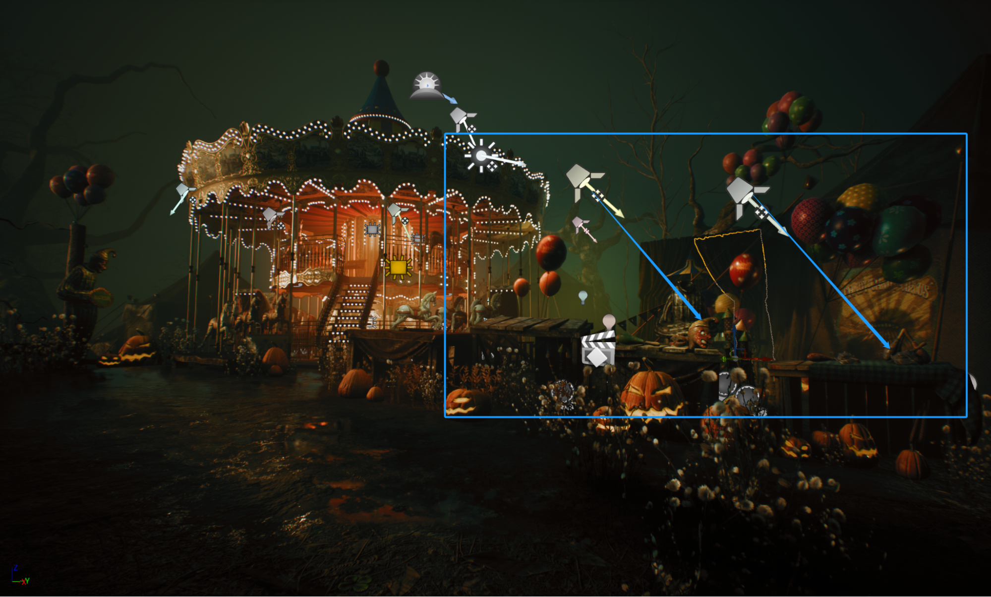
The directional light serves as the primary light source for shaping the entire scene. There are a few area-based spotlights with angles synchronized to the directional light. Since the scene is relatively shallow in terms of distance, the local spotlights are placed like a highlight brush to emphasize the features of the main assets.
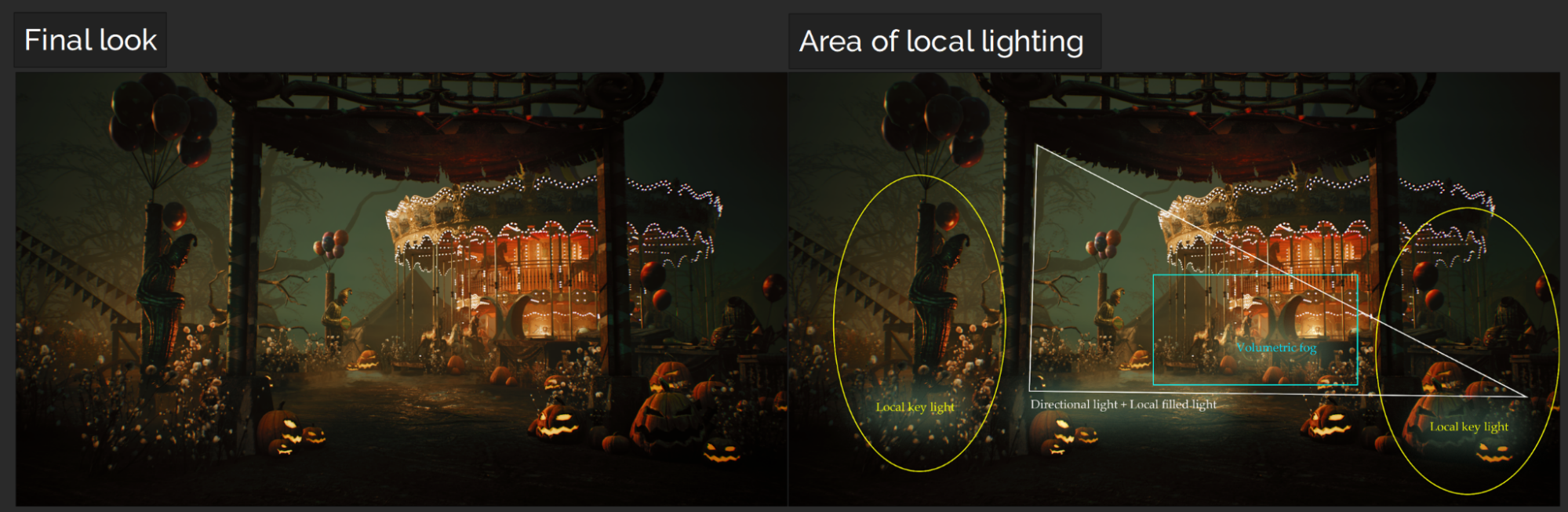
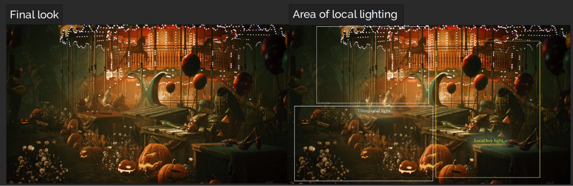
As my scene is quite compact, I have marked the lighting setup by area for ease of readability. The white triangular area is mainly illuminated by the directional light alone. I have adjusted the volumetric fog parameters for both distance and scattering to ensure that the fog is visible when triggered by both the directional light and the local point lights.
The image below is divided into 3 areas while in the lighting design phase shown below.
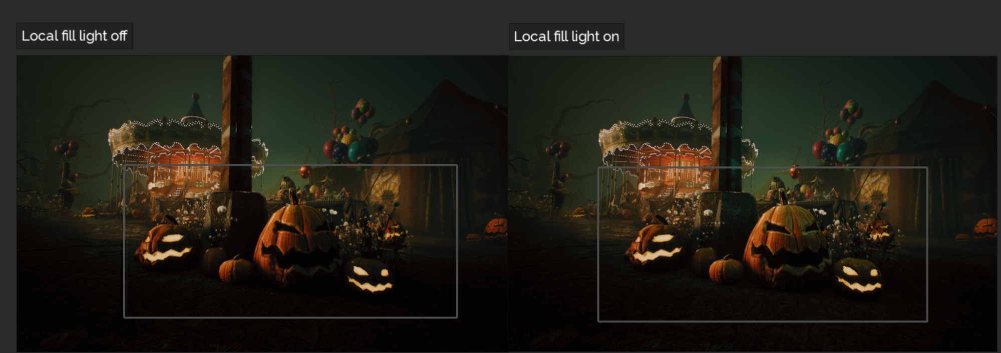
- A giant non-shadow-casting point light is placed as a volumetric fog trigger at the center of the carousel. From the perspective of lighting design, the carousel should be my main local light source to sell the depth of distance from my camera angle.
- As the carousel wears a lot of small point lights, it could look rather ‘noisy and loud’ if I only light it up. As the buffoon features standing right in front of the carousel, using volumetric fog for the carousel could distinguish the foreground from the busy looking carousel in the background.
- There are two parts of the volumetric fog concept employed in this project. The one is to look after the overall atmosphere via a scattering effect triggered by the directional light. The other is the warm local volumetric fog triggered by a giant local point light located in the central area of the carousel.
Camera Shots
Since most of my recent work involves real-time lighting with UE5, the best way to showcase dynamic lighting is through the use of a cinematic camera. Specifically, this project revolves around a particular style for Halloween, aiming for a magnificent yet haunted look. Naturally, I have selected a focal range that includes both wide and close shots. For my lens choice, I have opted for a 24-70mm DSLR lens in a cinematic camera. This is also my most familiar focal range as I have used the same lens from Canon for many years during my time as a freelance photographer.
When shooting multiple shots of a single scene, it is very easy to break consistency due to the various available choices of lenses and camera types. I have found the most efficient way of choosing a cinematic camera is based on what is needed for each established shot.
In my case, I need to introduce the scene and provide some interesting movement without going overboard. This is why I have opted to use the 24-70mm focal range for all of my shots, adding some truck (moving the camera side to side) and dolly (moving the camera closer or farther from the object without changing the focal length). To avoid interference with the front vegetation, I also utilized a bit of pedestal movement (moving the camera up and down without changing the focal length) in the final long take. I tend to avoid zooming in or out on the lens for close shots, as I prefer the results produced by physical movement of the camera itself. Moreover, movements like this in the 3D world are much easier than in real-life camera setups, so why not take advantage of it?
Negative lighting
When lighting a scene, both light and shadow require equal attention.
The scene contains many fascinating assets, thanks to the talented modelers who created them. However, in terms of the environment, it is situated in a flat area. I did add some tree branches in the background, but it is still challenging to achieve an interesting contrast without any additional coverage.
To enhance the contrast level in this lighting design, I decided to add a couple of invisible shadow planes along the left side of the glade area. Shadow planes, or shadow flags, are crucial for reducing the flatness of the overall composition. By carefully designing their placement, this additional shadow control method is excellent whenever I want to add more contrast to my scene, aside from post-production.
Want to read a bit more?
Below are some interesting question asked by our Exp Point friends, I will just leave here in case anyone might enjoy reading a bit further.
Areas Looking to Grow as an Artist
Keeping tech-related skills up-to-date is undoubtedly a necessity, especially when working with the latest real-time lighting technology in video game editors. Since I primarily work with Unreal Engine, I have the pleasure of utilizing its amazing Lumen as the real-time lighting solution. Additionally, I also enjoy exploring other real-time rendering technologies, such as those from Nvidia. As an artist, I consider myself a user in terms of the latest technology, and it is always beneficial to stay current with the latest advancements.
Aesthetically, I enjoy exploring various media other than games whenever I am seeking new ideas. It is fascinating to see how artists use their unique methods to express ideas through different media. Moreover, I still relish watching musicals or street performances. Anything that is live captures my attention much more than a video clip on Instagram or Twitter. Although seeing the artwork itself is incredible, observing how people react to it is even more captivating to me.
Practice is the most effective way to continue evolving in any craft, and this is another motivation for me to keep myself current in terms of creativity.

Amazing work! just amazing and thanks for sharing your experience. Wish you all the best and keep it going!